
What are the 7 Principles of Design?
Balance, contrast, emphasis, rhythm, unity, proportion, and movement — what each one means and how to use it.
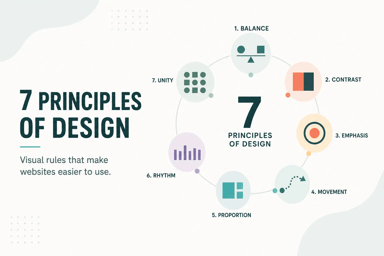
The seven principles of design are balance, contrast, emphasis, rhythm, unity, proportion, and movement. They are the rules a designer uses to arrange visual material so that a viewer can take it in — the difference between a page that feels considered and one that feels accidental.
They apply to almost anything visual: a poster, a book spread, a brand identity, a product interface, a website. The medium changes what the principles look like in practice. It does not change what they are.
The seven principles at a glance
| Principle | What it governs | The question it answers |
|---|---|---|
| Balance | Distribution of visual weight | Does the composition feel stable? |
| Contrast | Difference between elements | What stands apart from what? |
| Emphasis | Focal point and hierarchy | Where does the eye land first? |
| Rhythm | Repetition and pacing | How does the eye travel? |
| Unity | Cohesion of the whole | Does this belong together? |
| Proportion | Relative size and scale | What is important, and by how much? |
| Movement | Direction of attention | Where does the eye go next? |
Elements vs principles: the distinction that trips people up
These two lists get conflated constantly, and searching for one usually turns up the other.
The elements of design are the raw material — line, shape, form, space, color, value, and texture. They are the nouns.
The principles of design are what you do with that material. They are the verbs. Contrast is not a thing you place on a page; it is a relationship you create between things, using color or scale or weight.
So you cannot have a principle without elements to apply it to, and elements arranged without principles are just a pile of parts. When a critique says a layout “doesn’t work” but every individual piece looks fine, the problem is almost always at the principle level.
A note on the number: seven is a common convention, not a law. Different traditions count anywhere from six to twelve, splitting or merging categories — some lists separate pattern from rhythm, or variety from contrast, or add harmony alongside unity. The Bauhaus curriculum, the Gestalt psychologists, and modern interface guidelines all carve it up slightly differently. The seven below are the set most design education settles on.
1. Balance
Balance is the distribution of visual weight across a composition. Weight comes from size, color, density, and contrast — a small patch of saturated red can hold its own against a much larger area of pale gray.
Symmetrical balance mirrors elements across a central axis. It reads as formal, stable, and traditional — the reason it dominates classical architecture, currency, and institutional identity. It is also the easiest kind to achieve and the easiest to make dull.
Asymmetrical balance gives elements equal visual weight without mirroring them. A large quiet area on one side offsets a small dense one on the other. It is harder to get right and almost always more interesting — most editorial and modern brand work lives here.
Radial balance arranges elements around a central point, like a compass rose or a chrysanthemum. It is uncommon, but when the subject genuinely has a center it is unbeatable.
The useful test is to squint at the work until the detail disappears. What is left is the weight distribution, and imbalance is obvious the moment you stop reading the content.
2. Contrast
Contrast is difference, deliberately created. Without it, everything competes equally and nothing registers.
It operates through color (light against dark, warm against cool, saturated against muted), scale (a headline that dwarfs its body text), shape (a circle among rectangles), weight (bold against regular), and texture (a rough surface against a flat one).
Contrast is also the principle with a hard accessibility floor. Text needs a measurable contrast ratio against its background — 4.5:1 for body copy, 3:1 for large text, under WCAG. This is the one place where an aesthetic judgment has a number attached, and the number wins. A pale gray caption on white may look refined and still be unreadable to a substantial share of the people you are designing for.
The most common failure is not too little contrast but too much of it everywhere, which produces noise rather than clarity.
3. Emphasis
Emphasis creates a focal point — the thing the eye finds first and the anchor everything else is read against.
You establish it by making one element differ from its neighbors: bigger, bolder, brighter, isolated by space, or the only one of its kind. Isolation is the most underused of these. A single element with room around it draws the eye more reliably than one that is merely large.
The discipline is subtraction. If three things are emphasized, none of them is. A composition can support one dominant focal point, a secondary point, and then supporting material — a hierarchy, not a competition. When everything shouts, the viewer picks their own focal point, and it will not be the one you wanted.
4. Rhythm
Rhythm is the pattern created by repeated elements and the intervals between them. Like its musical namesake, it sets a pace.
Regular rhythm repeats at consistent intervals — a grid, a column of evenly spaced cards, a run of identical margins. It is calm and predictable, and over a long stretch it becomes monotonous.
Alternating rhythm cycles between two or more states, the visual equivalent of a strong-weak beat.
Progressive rhythm changes a property in steady increments — elements that grow, tighten, or shift in color across a sequence. This is what carries the eye in a particular direction, which makes it the principle most closely tied to movement.
Rhythm is also where deliberate interruption does its work. A regular pattern that breaks once makes the break the most emphatic thing in the composition, without adding anything new.
5. Unity
Unity is the sense that everything belongs to the same piece of work. It is the principle most easily lost as a project grows and most obvious in its absence.
Three mechanisms produce it:
- Repetition — reusing colors, shapes, type styles, and spacing values so that the vocabulary stays small.
- Proximity — grouping related items and separating unrelated ones. Distance carries meaning; things placed near each other are read as connected whether or not you intended it.
- Alignment — sharing edges and a common grid, so relationships between elements look chosen rather than incidental.
Unity is in permanent tension with contrast and variety. Push too far toward unity and the result is uniform and lifeless; push too far the other way and it stops reading as one thing. The resolution is a constrained palette used with genuine variety inside it — which is precisely what a design system is.
6. Proportion
Proportion is the relationship between the sizes of things — element to element, and element to the whole.
Its main job is hierarchy. Relative size tells the viewer what matters before they read a single word. When a heading is only slightly larger than its body text, the hierarchy is ambiguous and the eye has to work it out from the content instead of the form.
Proportion also governs the ratios designers reach for repeatedly: the golden ratio (roughly 1:1.618), the rule of thirds, and modular type scales where each step multiplies the last by a constant. These are not magic. They are a way of ensuring differences are decisive rather than accidental — a scale of 16, 18, 20 reads as indecision, where 16, 24, 36 reads as intent.
The classical claim that the golden ratio is uniquely pleasing to the eye has never held up well under testing. Its practical value is that it is a consistent ratio, and consistency is what the eye actually rewards.
7. Movement
Movement is the path the eye takes through a composition. Every design has one, whether it was planned or not.
It is directed by the principles already covered: emphasis sets the entry point, proportion and contrast rank what comes next, rhythm carries the eye along a sequence, and alignment gives it a track to follow. Implied lines — a figure’s gaze, the angle of an object, an arrow — all pull hard.
In static media, movement is entirely implied. In interfaces it can be literal: transitions, scroll effects, elements that animate into place. Literal motion is powerful and expensive, in the sense that it consumes attention. It earns its place when it explains a relationship — where something came from, what changed — and wastes attention when it is only decoration. Motion should also respect a viewer’s prefers-reduced-motion setting, because for some people animation is not a flourish but a symptom trigger.
Using them
The principles are diagnostic more often than they are generative. Few designers work through the list while composing. They are what you reach for when something is wrong and you cannot yet name it:
- Feels unstable or lopsided → balance
- Feels flat, nothing stands out → contrast
- Doesn’t know what it’s about → emphasis
- Feels monotonous, or chaotic → rhythm
- Feels like several projects at once → unity
- Hierarchy is unclear → proportion
- The eye doesn’t know where to go → movement
They are also a vocabulary, which may be their most practical use. “I don’t like it” ends a conversation. “The hierarchy is flat because the proportion between the heading and the body is too small” starts a solvable one.
None of this is a substitute for knowing what the work is for. A composition that satisfies all seven principles and communicates the wrong thing is still a failure. The principles govern how something is seen — not whether it was worth saying.
Further reading
- The Elements of Typographic Style, Robert Bringhurst — proportion and rhythm applied to type, and the best book on the subject.
- Thinking with Type, Ellen Lupton — a more approachable entry to the same territory.
- Gestalt principles — the perceptual psychology underneath proximity, unity, and grouping.
- WCAG quick reference — where contrast stops being a matter of taste.
If you are applying these to a website in particular, the psychology behind how visitors read a page covers the behavioral side, and what small businesses should know before buying a website covers what to ask for when someone else is doing the designing.